This site uses cookies to improve your experience. To help us insure we adhere to various privacy regulations, please select your country/region of residence. If you do not select a country, we will assume you are from the United States. Select your Cookie Settings or view our Privacy Policy and Terms of Use.
Cookie Settings
Cookies and similar technologies are used on this website for proper function of the website, for tracking performance analytics and for marketing purposes. We and some of our third-party providers may use cookie data for various purposes. Please review the cookie settings below and choose your preference.
Used for the proper function of the website
Used for monitoring website traffic and interactions
Cookie Settings
Cookies and similar technologies are used on this website for proper function of the website, for tracking performance analytics and for marketing purposes. We and some of our third-party providers may use cookie data for various purposes. Please review the cookie settings below and choose your preference.
Strictly Necessary: Used for the proper function of the website
Performance/Analytics: Used for monitoring website traffic and interactions
Ten Tips For The Aspiring Designer Beginners (Part 1). Ten Tips For The Aspiring Designer Beginners (Part 1). In this article, I want to share ten tips that helped me grow and become a better designer, and I hope these tips will also help you while you’re trying to find more solid ground under your feet. Luis Ouriach.
Bridging The Gap Between Designers And Developers. Bridging The Gap Between Designers And Developers. In the past couple of years, it’s no secret that our design tools have exponentially evolved. How do we bridge this gap between what is designed over what is developed without the overhead of constantly doing reviews?
Designing Better Links For Websites And Emails: A Guideline. Designing Better Links For Websites And Emails: A Guideline. A good practice for download links is to show the file format and size. When you share a bunch of files (let’s say in different formats or versions), it’s not enough to design each link correctly.
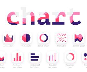
From Good To Great In Dashboard Design: Research, Decluttering And Data Viz. From Good To Great In Dashboard Design: Research, Decluttering And Data Viz. Tossing out suboptimal parts of our design can be a daunting task, especially after you’ve invested hours of work into it. Mediocre vs Great Dashboard Design.
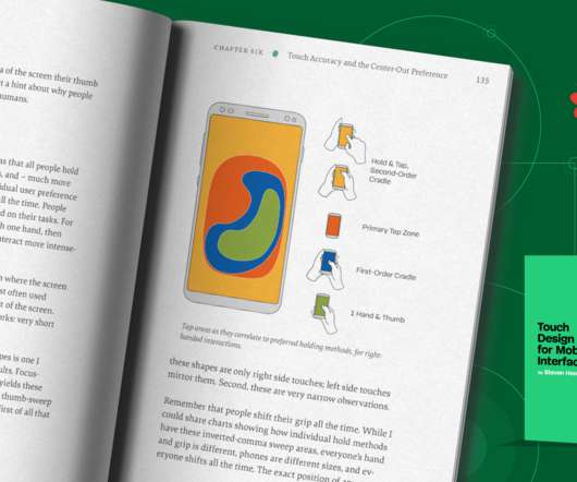
Meet Touch Design For Mobile Interfaces, A New Smashing Book By Steven Hoober. Meet Touch Design For Mobile Interfaces, A New Smashing Book By Steven Hoober. Touch Design for Mobile Interfaces presents and shares real information on hardware, people, interactions, and environments. Cover design by Espen Brunborg.
Existing bestpractices and guidance, such as the Web Content Accessibility Guidelines (WCAG), give us a solid foundation for inclusive design and already incorporate many details that affect dyslexic readers. In this article, we’ll look at ways to make an existing design dyslexia-friendly. An Existing Design.
What would the world’s most ideal, bestpractice and design research-driven highly legible serif, sans serif, and slab serif possibly be like? How good is a new typeface, and how good is it compared to a similar typeface designed in previous years? 400 pages , jam-packed with in-depth user research and bestpractices.
Traps in this area can be caused by following bestpractices that are not suitable for tests. This can occur for various reasons, but it usually happens when you try to take an easy, seemingly convenient shortcut, disregarding testing bestpractices. Any test, no matter the type, should be designed plain and simple.
Designing For Micro-Moments. Designing For Micro-Moments. A couple of years ago, Google announced a new mobile-first initiative it wanted web designers and marketers to pick up on. In Myriam Jessier’s " Things Designers Should Know About SEO In 2018 ", she sums up Google’s four micro-moments: “I want to know.”. “I
Continue reading below ↓ Meet Smart Interface Design Patterns , with Vitaly Friedman. With 100s of real-life examples , guidelines and bestpractices that you can apply right away. This free e-book from the Copyblogger team is designed to get you up and running with the copywriting basics in ten easy lessons.
Component-based design, enabled and enforced by modern JavaScript frameworks, does not only provide great developer experiences and project ergonomics when used in a smart way, but it can also offer advantages for accessibility. With bestpractices and guidelines on accessibility, assistive technology and inclusive design patterns.
Search engine optimization (SEO) is an essential part of a website’s design, and one all too often overlooked. Implementing SEO bestpractice doesn’t just give you the best chance possible of ranking well in search engines; it makes your websites better by scrutinizing quality, design, accessibility, and speed, among other things.
To cater for new and unique artworks on a regular basis, we started our monthly wallpapers challenge more than ten years ago, and from the very beginning to today, artists and designers from all across the world have accepted the challenge and submitted their designs to it. Designed by Ricardo Gimenes from Sweden. Join in! ?.
That’s not to say the extraneous content is pointless — enhanced design and user interfaces can have an important impact on the brand of a website, and delightful little extras can really impact your users’ relationship with your site. For Smashing Magazine, that involved dropping some of our web fonts. And Is It Used?
Created by Jon Yablonski, this lovely website explains 21 psychological principles that designers can consider to create more human-centered products and experiences. The right tools at the right time, help streamline the design process. User experience research is a crucial component of the human-centered design process.
Our vision with Hydrogen and Oxygen is to unlock the best of both worlds and make building and running the next million of modern — dynamic, contextual, and personalized — storefronts easier, more cost-effective, and fun. Continue reading below ↓ Meet Smart Interface Design Patterns , with Vitaly Friedman.
In my opinion, one of the best use-cases for currentColor is styling inlined SVG elements. Whenever we export an icon from a design tool, it comes with a specific fill and other color values defined in the design. On design systems, UX, web performance and CSS/JS. Further Reading on Smashing Magazine. Conclusion.
Whether you’re just starting out with Figma or have been using it for a good while now, this post will give you just enough pointers to make your design process faster and smoother. design tokens. design systems. responsive design and testing. responsive design and testing. Table of Contents. accessibility.
There are a couple of questions we have to consider when organizing style within Next.js: How can we fit within the conventions/bestpractices of the framework? To solve the second problem, I take an approach that can be summarized in four pieces: Design tokens. Design Tokens. Not only does Next.js Global styles.
Note : If you’re looking for a complete overview of bestpractices and tools, have a look at the Frontend performance checklist. Meet Smashing Email Newsletter with useful tips on front-end, design & UX. But how do you find all these things causing performance issues? Waterfaller: A Tool Focusing On Network Waterfalls.
Continue reading below ↓ Meet Smashing Online Workshops on front-end & UX , with practical takeaways, live sessions, video recordings and a friendly Q&A. On design systems, CSS/JS and UX. Further Resources On Smashing Magazine. More after jump! With Carie Fisher, Stefan Baumgartner and so many others. Focus Styles.
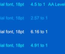
We saw how important it is to keep the typographic design parameters and variables the same to get a more accurate result while testing different typefaces. Research and design effort based on not good, okay, very good. Measurement: Research and design effort based on not good, okay, very good. Did you miss out on it?
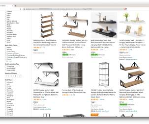
While there are many individual reasons, it boils down to two prominent use cases: optimizing your products and finding the best deals. “. Unless you’ve designed a truly innovative new product, the chances are that you can already find something at least similar on Amazon. Let’s start with the first scenario. More after jump!
You’ve spent months putting together a great website design, crowd-pleasing content, and a business plan to bring it all together. You’ve focused on making the web design responsive to ensure that the widest audience of visitors can access your content. You’ve agonized over design patterns and usability. Ken Harker.
The case for accessibility is this; we as stakeholders, managers, teams, designers and developers need to do better in not only practicing accessibility but advocating for it as well. without the need for special adaptation or specialized design.”. without the need for special adaptation or specialized design.”.
Continue reading below ↓ Meet Design The Perfect Navigation , with Vitaly Friedman. With 100s of real-life examples , guidelines and bestpractices that you can apply right away. Further Reading On Smashing Magazine. “ More after jump! From complex mega-dropdowns to carousels and filters. Online, and live.
We’ve explored the concepts behind headless CMSes in detail here on Smashing Magazine, but let’s do a quick recap. Also, building on an existing SDK has allowed us to follow the bestpractices recommended by the vendor while saving time. Technical and sales support. Enterprise features. Infrastructure Integration. Environments.
It is not that most web design agencies are ignorant of other marketing approaches or that any of them are inherently bad. On the contrary, in the second part of his two-part series on getting web design clients , Stephen Roe breaks down the opportunities of these approaches. However, in practice, the results can be underwhelming.
There is a lot of information about the bestpractices and awesome password-reset design patterns out there. Further Reading On Smashing Magazine. “ Doing this also adds to the good user experience metric, as it prevents the user from looking for a link or a button that takes them back to the login page. Final Thoughts.
How To Build An Ethical User Research Practice At Any Organization. Ethics are an important part of human-computer interaction because they keep people at the heart of the design process. Unethical practices at companies lead to the creation of technology that we all use but often neglect the influence of those intended to serve.
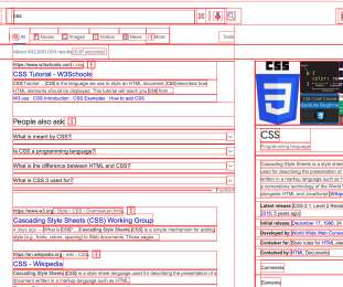
In 2013, A List Apart published Sustainable Web Design by James Christie. In this screenshot below, for example, we can see that loading the Smashing Magazine website for the first time incurs just under a megabyte of data transfer. Sustainable Web Design. Data transfer is one thing that we can measure quite easily.
When designing cards, you might want a border-radius to have a quite sizeable value when there is enough space to display it along with other cards. Continue reading below ↓ Meet Smart Interface Design Patterns , with Vitaly Friedman. With 100s of real-life examples , guidelines and bestpractices that you can apply right away.
Meet Touch Design for Mobile Interfaces , Steven Hoober’s brand-new guide on designing for mobile with proven, universal, human-centric guidelines. 400 pages , jam-packed with in-depth user research and bestpractices. Here’s how we are approaching it.
BestPractices When Writing Custom Directives. It is considered bestpractice not to directly access a state object. In a traditional app where we have signup, logins, or product page we want to have consistent behavior and design. UI kit built upon material design. This is the virtual node of Vue.js.
Continue reading below ↓ Meet Touch Design for Mobile Interfaces , Steven Hoober’s brand-new guide on designing for mobile with proven, universal, human-centric guidelines. 400 pages , jam-packed with in-depth user research and bestpractices. More after jump! Jump to table of contents ?. all the way down to 1.7
A measly front-end designer like me can be blissfully ignorant of all this mumbo-jumbo. Let’s look at it for a site that’s much “heavier” than Smashing Magazine. A font is a branding consideration as well as a design asset that can enhance the legibility of a site’s content. Hey, look at that — great job, team!
Continue reading below ↓ Meet Smashing Online Workshops on front-end & UX , with practical takeaways, live sessions, video recordings and a friendly Q&A. On design systems, CSS/JS and UX. CSS is designed to not lose content, to not cause harm. More after jump! Jump to online workshops ?. Debugging Overflow.
Continue reading below ↓ Meet Smashing Online Workshops on front-end & UX , with practical takeaways, live sessions, video recordings and a friendly Q&A. On design systems, CSS/JS and UX. This component incorporates several image-related bestpractices. More after jump! Jump to online workshops ?.
To address this problem, I’ll provide an overview of the bestpractices for the integration and optimization of an LCP image. Meet Adam Silver’s Form Design Patterns , a practical guide to designing and building forms for the web. It becomes especially tricky to optimize when the LCP element is an image.
Now, let’s dive into the technical features and bestpractices that my team adopted in the process of building the WaterBear web app. I plan on sharing specifically what I learned from performance and accessibility practices as a first-time lead developer of a team , as well as what I wish I had known before we started.
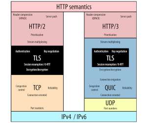
It combines decades of deployment experience and bestpractices of TCP with some core new features. Given this clear evolution towards always-on TLS (especially for web traffic), it is no surprise that the designers of QUIC decided to take this trend to the next level. Conclusion. Let’s summarize what we’ve learned in this part.
Constantly improving the user experience (UX) and design (UI) for you, so that content creators and developers feel comfortable creating new fields, components or pages. It’s an architecture designed to make the web faster, more secure and easier to scale. This architecture is also known as Jamstack.
It is recommended to follow rules and bestpractices of building and sending emails. It is important to make sure that your message looks as designed for all your recipients. Design Your Mobile Emails To Increase On-Site Conversion. How can we address these challenges? Large preview ). But how do we know that they work?
We organize all of the trending information in your field so you don't have to. Join 5,000+ users and stay up to date on the latest articles your peers are reading.
You know about us, now we want to get to know you!
Let's personalize your content
Let's get even more personalized
We recognize your account from another site in our network, please click 'Send Email' below to continue with verifying your account and setting a password.

 132
132 


Let's personalize your content